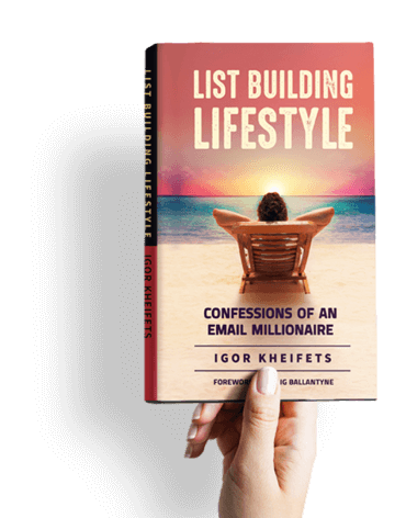

In this episode, Igor shares one of the most counterintuitive lessons he keeps relearning after decades in internet marketing. How do beautiful designs and crude designs compare in conversion? He has tested this dozens of times across sales pages, email layouts, book covers, and even full webinar environments. The result is almost always the same.
[00:53] The AI Design That Lost the Split Test:
- Igor’s AI assistant, trained with full context about his business, products, and campaigns, redesigned the sales page for his book The List Building Lifestyle.
- The result was a stunning golden-black design that looked like a $10,000 professional design job.
- He ran it against the original, less polished page. The original won. He reverted all traffic back immediately.
- This has happened to Igor dozens and dozens of times across different assets. Crude beats glamorous almost every single time.
- He cannot fully explain it, but his best guess is that beautiful design may distract people from the message itself.
[03:55] The Webinar Environment Test — Half a Million Dollars and Zero Difference:
- Igor ran cold traffic from YouTube ads into an automated webinar funnel for nearly two years, pushing over half a million dollars in ad spend while continuously optimizing.
- A team member with a design background proposed a Dyson-style upgrade. Just as Dyson transformed vacuum cleaners into desirable, beautiful objects, they would transform the webinar environment into something slick, modern, and high-quality.
- The new environment had a better-looking video container, a more readable chat, emoji-style announcements appearing at key moments, and an overall higher standard presentation.
- They pushed 1,000 leads through the crude environment and 1,000 through the beautiful one. Conversions were exactly the same. Not roughly the same. Exactly the same.
- This was the closest Igor has ever come to getting a conversion bump from visual components alone. And it still moved nothing.
[07:06] The Rule of Thumb That Keeps Proving Itself:
- Visually appealing elements are still worth building. Nobody wants an embarrassing product. But the assumption that better design equals better conversions is simply not supported by the data.
- The actual rule of thumb, proven across sales pages, email layouts, book covers, and webinar environments, is that the crude and simple version will out-convert the polished and beautiful version more often than not.
- Stop fooling yourself that a design upgrade will move your numbers. Focus on the message. The message is what converts.
Get Igor’s Free Book — List Building Lifestyle: Confessions of an Email Millionaire
A great book for anyone who wants to build a responsive email list, create sales without relying on social media, and grow an online business with more leverage, freedom, and control. Inside, Igor breaks down the list-building and email marketing strategies that helped him turn email into a scalable income stream.
You’ll also get access to a full bonus package with templates, swipe files, and traffic strategies used to build and monetize lists fast.
Visit: www.igorsbook.com